FlyPay
Overview
Flypay is an innovative African company specializing in B2B and B2C digital wallet payment services. We provide seamless and efficient payment solutions using QR code scans, ensuring cost-efficient and affordable processing fees.
This was a project for a start-up company that I did where i spent a lot of work hours, a large amount of my spare time and weekends working closely with the founder and a small team of engineers to build the vision.
Role
Product Designer, UX Researcher
User Research, Interaction, Visual design, Prototyping & Testing, Information Architecture, Pitching.
Feb 2022 - Sep 2023
Background
Flypay, aims to transform payment solutions with seamless QR code transactions. Our focus on streamlining point-of-sale management empowers businesses to elevate customer experience and maximize operational efficiency. By closing the loop on transaction management for smooth and efficient transactions.
I joined Flypay as a the lead product designer a year ago of 2 designers in a start up company of over 15+ workers including 3 engineers, 3 designers and 2 product managers. I Created design across major aspect of the business and was responsible for leading UX and UI design across key parts of the application side of the platform.
During my time at I've been extremely fortunate to have been part of this journey and have grown tremendously, some key achievements of which I have listed below:
- Turned an idea into a product. The ability to transform an idea into something much more tangible is a process that is both tasking and rewarding. I worked closely with the founder and team to shape the product vision and strategy of Flypay. While the product is still undergoing development and has not yet been released to the public, seeing how far we came and how much we have grew as a start-up team is truly sensational.
- Implemented a design process. This helped our team establish more structure to how we conduct our work and allow other teams to gain visibility across our upcoming sprints..
- Establishing a design system. This has helped the Engineering and Product teams to understand how and why we choose to implement certain components over others.
- Worked all round the clock. Working in an early-stage startup is not easy. I dedicated hours of my spare time and weekends conducting research, sketching, testing and designing the product.
Understanding The Problem
In Africa, numerous digital platforms encounter persistent challenges with failed transactions, particularly in POS systems and bank transfers. These issues can severely impact user experience, undermine customer trust, and impede business operations.
To validate the information, the team lead and i proactively conducted a brief survey and interview among peers and local shop owners. This initiative aimed to gain valuable insights and corroborate the facts at hand.
Our research encompassed:
- Conducted thorough research to understand user goals and needs, laying the foundation for user-centric design.
- Identified and analyzed user pain points within existing brands, highlighting opportunities for improvement..
- Engaged stakeholders directly with proactive research to ensure data accuracy and relevance.
The Process
Since Flypay is a start-up aiming to create its first-ever product, we had to utilize the lean UX process with the aim that deliverables were as detailed as possible and responded adequately to the product requirements that were laid down at the start of the project.
UX research
With the help of our research, we gained deeper insights into user behaviors, needs, and motivations by employing observation techniques and task analysis. Our approach involved a combination of qualitative and quantitative research methods to comprehensively understand the challenges users encounter while attempting transactions in today's digital landscape. This multifaceted approach allowed us to uncover both the intricacies of user interactions and patterns shaping their experiences.
User Persona
By leveraging user personas like Fatima, we gain insights into the specific needs, goals, and challenges of our target audience. This enables us to tailor our platform to better meet their requirements and enhance the overall user experience.
Empathy Map
This empathy map helps us understand Fatima's thoughts, feelings, and behaviors, as well as her pains and gains. By empathizing with Fatima's perspective, we can better tailor our solutions to meet her needs and support her goals as an entrepreneur.
Problem Statement
After compiling findings from research, I collaborated with my team to define the problem.
Problem Statement: "Users face significant challenges during transactions, stemming from various factors. These hurdles hinder the seamless and efficient execution of transactions, ultimately leading to a negative impact on user experience and trust in payment systems.".
Products Vision
As a product, we wanted to position ourselves as the company that helps businesses streamline their point-of-sale experience with three key focused areas:
To initiate our project, our team conducted comprehensive market research on competitors to gain insights into the current offerings in the market. By analyzing various apps, we identified particular features that resonated with us and presented opportunities for our product.
- Ease Of Use: We want to create a product that is simple and straightforward for users to understand and navigate through, with the aim of providing a smooth transaction experience.
- Convenience: We want to create a product that promotes convenience for users with busy lifestyle, enabling them to perform tasks/transaction efficiently and without unnecessary hassle.
- Reduced Cost: We want to provide a cost-effective solution that provide value to both users and merchants without breaking the bank. The product aims to attract budget-conscious customers and help businesses save money while still enjoying the benefits of our solution.
To initiate our project, our team conducted comprehensive market research on competitors to gain insights into the current offerings in the market. By analyzing various apps, we identified particular features that resonated with us and presented opportunities for our product.
Gathered Insights
Utilized user interview and survey data to conduct affinity mapping, collaborating with team members to synthesize identified pains. Grouped problems into common themes and features, facilitating targeted solutions for platform enhancements.
After listening and compiling data from the survey, we discovered the top frustrations:
- Complexity: Transactions involving multiple steps or complicated processes can be challenging for users, leading to frustration and errors.
- Technical Glitches: Technical glitches, server downtime, or slow processing speeds can disrupt transactions and cause delays in payment processing/failed transactions
- Security Concerns: Many people are wary of potential security breaches and inaccuracies in financial transactions erode trust in existing payment mechanisms.
- Financial Burden: Merchants encounter exorbitant processing fees from traditional payment solution providers.
Defining The MVP
I facilitated workshops and sketching sessions with the team via Google Meet to collaboratively map out the user flow and develop a storyboard to capture the Minimum Viable Product (MVP) concept. Through these interactive sessions, we leveraged our collective creativity and expertise to design a seamless user journey and visualize the key features which are:
- QR Code Generation: Allows for merchants the ability to generate QR codes for their products or services.
- QR Code Scanning: provides customers with the Capability to scan QR codes using their smartphones to initiate quick payments.
- Transaction Management Dashboard: A basic dashboard that enables the ability merchants to view transaction history, track payments, and manage orders.
- User Authentication: The user authentication mechanism enables easy user account creation and login functionality, allowing users to securely access their accounts, view transaction history, and manage their payment preferences.

To kickstart the engineering process, I translated the team's ideas into a wireframe solution based on the above problems identified, I worked towards addressing these pains by coming up with potential solutions mockups for the MVP's main screens. Here's what I came up with
- Login screen
- Register profile
- Scan to pay
- Split Bill Page
- Business Wallet page
The Design
During the project, I swiftly produced basic mockups of the user journey, prioritizing a simple UI with a dark color gradient to accommodate users with visual impairments. These mockups were then refined with desired styling. I developed a clickable prototype using Invision for developers, ensuring they had a clear understanding of the intended user experience.
User testing was integral to our process, conducted iteratively at each milestone to ensure alignment with user needs. Feedback was actively gathered, and prototypes were revisited and tested accordingly.
Onboarding Screens:
I designed the onboarding screens to be user-friendly and illustrative, ensuring that users can easily grasp the app's purpose and functionality through visuals. This approach enhances user understanding and engagement, making the onboarding process intuitive and enjoyable.

Signup/Login Screens:
I segmented the signup process into two parts to cater to different business types: small businesses or individual accounts, and large companies with multiple staff members. Each segment was prompted to provide relevant information tailored to the specific needs of the business type, ensuring a streamlined and personalized signup experience for all users.
immediately after verification, users are prompted to set their security pins, prioritizing safety in transactions from the outset.
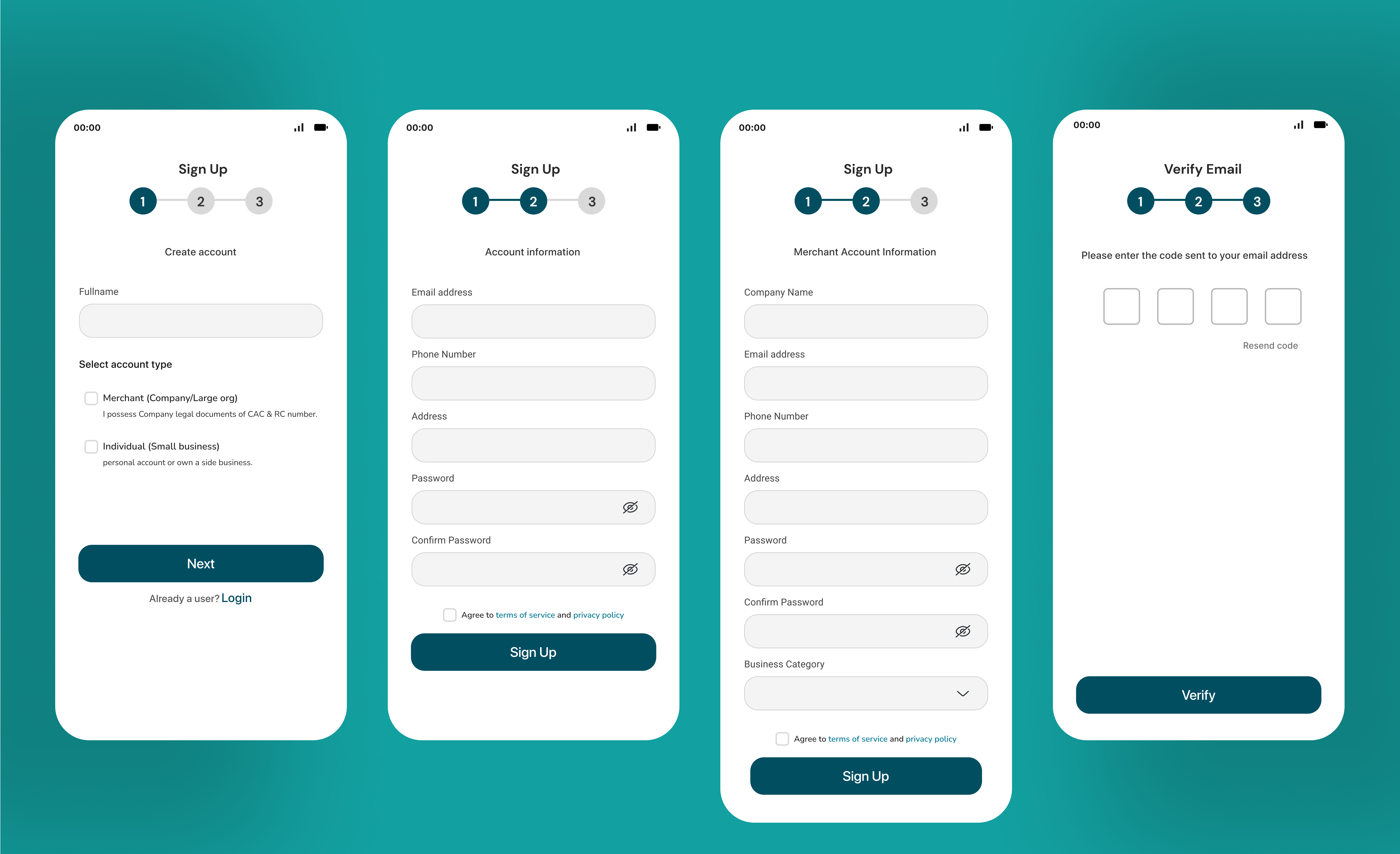
.jpg)
Landing Page & Merchant Dashboard : The landing page for both users and merchants features a streamlined design. The user screen offers easy access to all features, including the Scan feature, ensuring a simplified experience. On the other hand, the merchant dashboard serves as a comprehensive management Dashboard which serves as the hub for entrepreneurs to monitor and manage their financial inflow and outflow generated by users scanning their unique store code. This dashboard is highly responsive, accessible not only through the mobile app with limited features available but also via the web app with unlimited features, ensuring a seamless experience with enhanced visibility and efficiency.
.png)
.png)
Top-Up & Split Bill : Another essential feature for users is the Split Bill functionality, designed to facilitate seamless bill splitting among a group of friends in a safer and faster manner. Once the issuer has scanned the store QR code, all other participants can simply accept the invite and immediately contribute to the shared bill. Additionally, the Top-Up feature allows users to conveniently add funds to their wallet either through scanning a QR code or externally via bank transfers using the provided account number.
.png)
Scan To Make Payments : The standout feature of our user platform is the Scan to Pay functionality, designed to facilitate seamless and instant transactions with just a few clicks and a quick QR code scan. This feature is tailored to enhance the user experience, making transactions effortless and efficient.
.png)
Result And Takeaways
My time at Flypay, an early-stage startup, was an enlightening journey filled with valuable lessons. It presented me with a steep learning curve, teaching me the importance of focus, time management, and where to channel my energy and efforts effectively. This experience has been instrumental in shaping my approach to work and navigating the dynamic environment of startups.
some key takeaway from this project include:
- Focus on implementing an MVP. In the startup realm, timelines for product delivery are often tight and demands a lot of effort, especially when balancing full-time commitments. Therefore, it becomes important to prioritize features that offer the most significant value to users.
- Focus on the issue. At the end of the day the design is meant to solve every prospective user's problems so as to ensure you are not building for yourself and that your process is truly user-focused; Hence you must be prepared to always iterate and receive critics from team mates.
- Worry less about details. When sketching, it's normal to make mistakes, and your UI might appear imperfect. But don't fret—designing a product isn't only about achieving perfection; it's about delivering performance. By focusing on the user flow, i was able to prioritize the user experience effectively.


